
UX Cases - Design Thinking Process

Project


i - How Can We Make a Difference?
While you must be thinking about this question from the perspective of plastic pollution, me and my team members, were thinking, how can we make a difference as UX designers? The answer to our question led us to our client FOS, a sunglasses brand based in Barcelona.
This company is not just a brand but a movement towards a more sustainable future. One where we replace the current linear model “take-fabricate-throw away” with a circular design service that eliminates the concept of waste. This radical, generative and restorative approach mimics nature in every way possible to create a waste-free future we can all stand behind.
Once we learned about them we were sure where our journey was headed to.
The Stakeholder Interview
During our first stakeholder interview we found out that this social movement started locally with two design engineers, Aniol and Marc, and an ambitious dream to grow globally. With the support of three UX designers, we became a team of five, all on a mission to change the way people think about buying fashion.
We immediately mapped out FOS’ ecosystem to understand our stakeholders’ needs better and through that highlighted their main problem statement.

ii - Problem Statement
After analyzing FOS’ ecosystem with our stakeholders, we identified two main stages where our clients faced difficulty and felt stuck with the entire vision and the process. We marked those stages and identified the problem statement.

Client’s Problem Statement
HOW MIGHT WE..
encourage maximum users to buy recycled sunglasses as a fashionable product?
Apart from the main problem statement we also learned a few more facts about FOS.
Their current target audience were millennials.
Even though they have an online platform to sell their sunglasses, majority of the pairs were sold through their workshop experience where users scheduled their visit with them for a few hours and handcrafted their own sunglasses while learning the importance of upcycling plastic waste. They also got to know about the circular design service where users can return their sunglasses to FOS, once worn off, and get a new pair with discount.
After collecting this valuable data, it was time to design our UX process and begin our journey to understand the most crucial part of this project ‘THE USER’.
iii - UX Process

iii(1) - Empathize
To begin our first stage, we designed an extensive research plan that focused on discovering current trends, identifying our competitors and conducting a contextual inquiry to empathize with our users. We wanted to gauge our users’ perception of the sunglasses and gain valuable insights into their wants, needs and desires.
Our research plan consisted of various research methodologies and tools that helped us go through the process step by step.
Research Methodologies
Stakeholder Mapping
User Research (Qualitative and Quantitative)
Competitive Research
Desktop Research
Research Tools
In-depth Interviews
Surveys
User Journey
Contextual Inquiry
Story Boards
Empathy Mapping
Epic Stories
Card Sorting
While we were eager to know our USER, it was important to understand the product first. So as a team we decided to have the workshop experience ourselves and analyze the raw material, the process and most importantly, the finished product i.e. the sunglasses in order to become well informed as to what we are trying to showcase to our user.
Workshop Experience (BTS)

We learned the whole process of upcycling plastic waste, creating different color ratios and molding it into one of a kind frame. While we learned that every frame was unique because of the difference in colors used, we also got to know that so far FOS only had one frame style available.
Once we experienced their workshop firsthand, we walked away with our own custom-made pair of sunglasses and an undeniable sense of satisfaction-we were hooked!
As newly formed brand ambassadors, we set out on a mission to make sure our users could see how valuable this experience is and make them fall for these sunglasses and the entire brand concept.
But that’s where we faced our first TWIST in the story...
Cultural Probe
We designed a fun and colorful cultural probe with the intention to show the custom made sunglasses to our users as well as ask a set of questions from them. With our props we went to different coffee shops where we expected to see our existing and potential target audience.

Our user reactions and responses were key to this research so we decided to analyze them in two different rounds.
Round 1
We planned to show the sunglasses to the users first and then communicate the brand philosophy and workshop experience behind it.
During this round we observed their interaction with the sunglasses and highlighted their concerns towards it. Some users qouted:
“Why is it plastic? it looks cheap.”
“Oh I like the colors. But the frame is not so trendy.”
“I don’t like to purchase sunglasses online. I don’t know how they will look on me in reality.”
“I’d like to have more frame choices”
“These can be my beach sunglasses. I won’t worry if I lose them over there.”
“I like how light weighted they are.”
Once they got to know how these sunglasses were made out of upcycled plastic waste and the fact they can design their own pairs in the workshop, users became more excited about the sunglasses.
Round 2
We planned to communicate the brand philosophy and workshop experience to the users first and then show the sunglasses.
The interesting part was that in this round almost every user immediately got connected with the sunglasses as well as the whole experience behind it. Some users qouted:
“This is amazing. I would definitely buy my sunglasses from here.”
“I strongly support those brands who care about the environment.”
“I want to own a lot of sunglasses with so many colors and wear them with my different summer outfits.”
“I would prefer trying them on first and then purchase.”
“I want more frame styles that are trendy these days.”
“I would love to take this workshop. It will be so cool to make my own pair.”
After analyzing our results we realized how important story telling was for the brand to connect with its target market and encourage them to buy upcycled sunglasses.
In-depth Interviews and Survey
With the help of our user insights from the cultural probe, we designed our in-depth interview and survey questions. During this stage of research we were able to confirm FOS’ target audience, Millennials. We also identified their purchasing patterns, brand preferences and over all perception towards upcycling products. In addition, we realized that Gen Z’s were a potential target audience for FOS and while working on the solution we should create content for the platform and social media that caters to both audiences. Apart from that, we were also able to highlight some major insights from both our qualitative and quantitative research that later helped us defining and ideating our solution.
Research Findings

Qualitative Data
What do you look for when you buy sunglasses?
“Something that goes with my style and personality... because I don’t like to wear things that everyone else is wearing.”

Quantitative Data
Would you prefer buying sunglasses in a shop or online?
Out of 72 responses, 79% preferred buying sunglasses in a shop.
From all the research conducted so far, we analyzed that our users were more comfortable purchasing sunglasses in a shop, rather than online, where they could try them on and choose their style.
They also gave more priority to customizing their own pairs and have access to a variety of trendy frame styles. For them, buying these sunglasses as an environmentally sustainable fashion item was like a cherry on top.
That’s when we figured out the twist..
While we were busy focusing on our client’s problem statement (mentioned above (ii)), our USERS had a completely different concern in mind.
User’s Problem Statement
AS A USER..
I want a personalized in-shop experience online.
And just like that we realized we have not only one but TWO problem statements to take care of.
So the three of us immediately started thinking about a new plan where we could kill two birds with one stone!!
iii(2) - Define
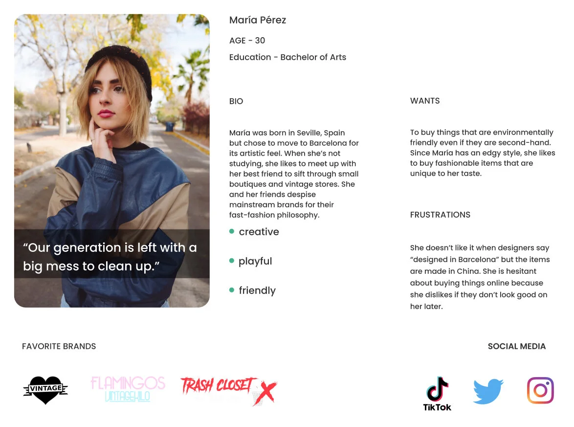
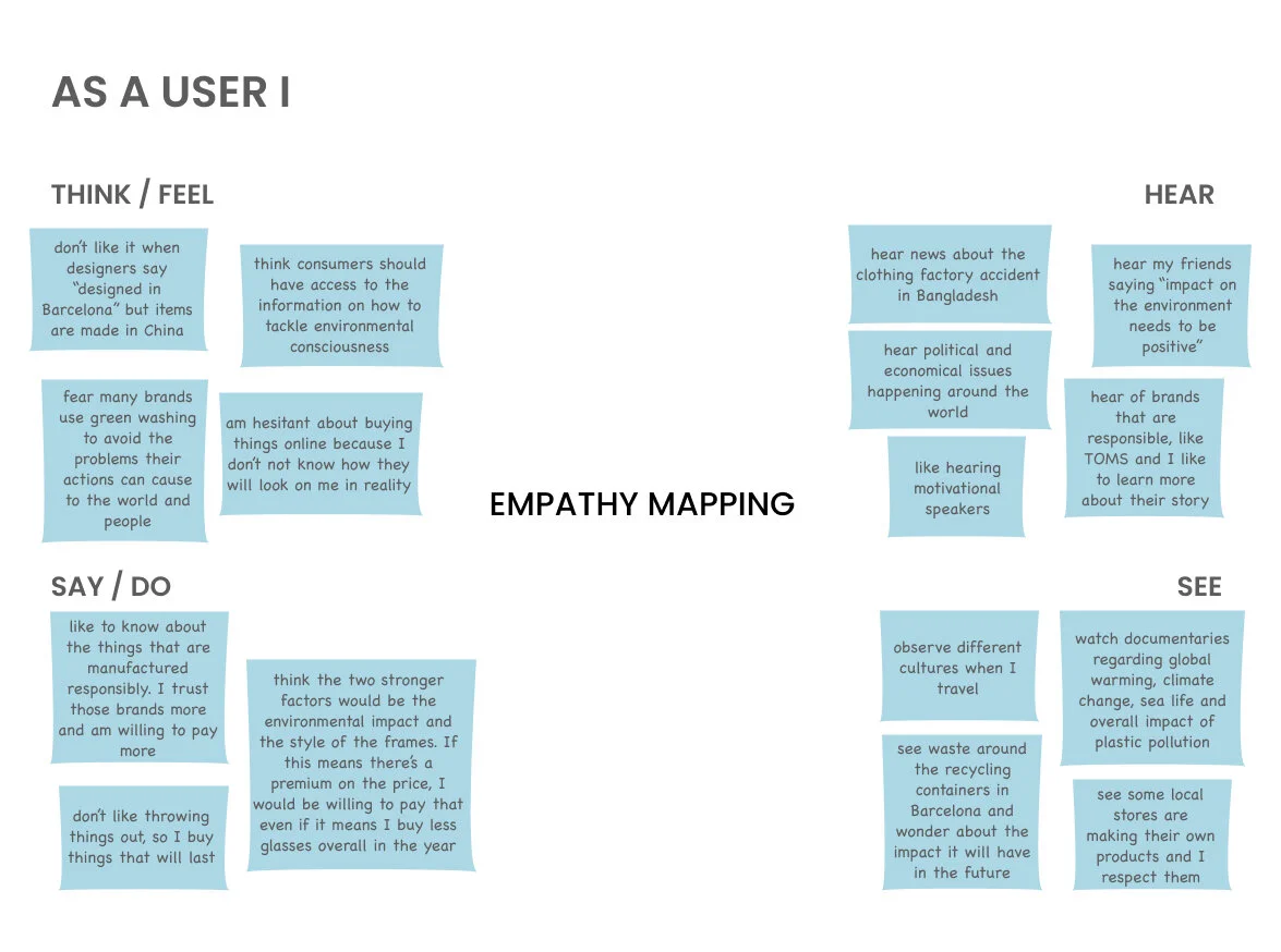
We used the data collected through our qualitative and quantitative research and started developing an empathy map in order to highlight the main user pain points.
We knew that this empathy map will help us define our target persona that we can study further in detail through their user journey and understand the main gains our client can provide to bring out the maximum user experience value.
*use left and right arrows to view persona and empathy map below.
FOS’ Value Proposition
After studying our persona, we wanted to develop a value propostition canvas in order to define the pains and gains of our target market and highlight the areas where our client can focus on working and improving the exisiting as well as potential pain relievers and gain creators.
Through our market trend research we learned that :
‘If people love a brand story, 55% are more likely to buy the product in future, 44% will share the story, and 15% will buy the product immediately.’ - Marketsmiths
‘80% of consumers are more likely to make a purchase when brands offer personalized experiences.’ - Epsilon
Apart from our user research these market trend facts also contributed in developing the canvas and connecting the dots between our user and the client.
FOS

USER

With this data in front of us, it was time to work on the Gain Creators and analyze if going in this direction would eventually help resolving our User Problem Statement.
I won’t hide the fact that at this stage we were eager to jump into the process of ideation and see if the end results would make sense or not. But before that we wanted to make sure we were understanding our current grounds well enough.
With the help of our EPIC and USER stories we decided to analyze the current online platform and service our client offers and on the basis of that identify the Minimum Viable Product (MVP) that is being defined by the company .
Minimum Viable Product (MVP)

iii(3) - Ideate
No matter how many times we map out the information, it was extremely important to constantly keep reminding ourselves that WE ARE NOT THE REAL USERS.
While the MVP we built helped us identify some core features required in the product, it was essential to not just get it validated from the real user but also analyze if they had a different definition for our MVP.
We thought the only way to find it out was if we handed over a blank canvas to our users and asked them to map out their thought process, so we began conducting the open card sorting technique.
We did it in person with some users and started observing the similarities as well as the differences in the order of the cards and their titles. Once we started observing a pattern, we decided to go for a closed card sorting technique and see if we could capture more similarities between both techniques or not.
It was no doubt a very useful method as it helped us understand how our real users visualize the online platform we intend to offer as well as iterate the feature prioritization on the current MVP.
This stage brought another BIG turning point for me and my team which helped us ideate a solution for one of the major objections we faced towards online shopping - “I WANT TO TRY THEM ON FIRST BEFORE BUYING ONLINE”
Card Sorting Result

While the rest of the cards were more or less predictable and followed a pattern from one user to another, one of the cards stood out to us the most as it was recommended by one of our users and once we started reviewing other users feedback on it we realized that it was time to get on board and work on our next turning point.
And that point was the....

Value Matrix
On one side we started conducting more user interviews based on the AR feature preference and on the other side we did another market research to evaluate it’s value to the online platform and our client. One of the marketing facts qouted:
‘Shopify recently made it easier for any brand to add AR content to their site, and Vogue reports that when a customer viewed a product in AR through Shopify, they became 65% more likely to make a purchase.’ - Vogue
Our users response as well as the data supported this feature enough to consider it.
We summarized the features list, developed the minimum lovable product (MLP) and mapped out the features matrix. From there we designed the Value Matrix which focused on
HOW MIGHT WE...
increase user engagement with the platform?

Information Architecture
Once we were able to figure out the over all value of every feature involved in our online platform, we proposed a new information architecture that showcased a new customization flow which allowed users to choose their own color, frame style and UV lens, just like they would in the workshop. Furthermore, the introduction of an AR feature was offered in order for the users to have the same in-shop experience online.

COVID - 19 (Market Trends)
During this stage, we also faced the new norms of COVID-19 that became a huge part of every single human and environmental activity. As a team we knew it was very important to understand this wave and how it will effect the present and the future of our user and the brand.
Another round of market research was conducted to analyze the situation and some key findings supported our brand ideology as well as the experience we planned to offer to our user.
- 59% consumers have used more local stores and services to help support them during the lockdown. - Deloitte Digital
- 57% of consumers say they will be more likely to spend money at a business that offers locally produced products once the lockdown has lifted than they would have done before the stay-at-home order was imposed. - Deloitte Digital
- (32%) consumers have used new brands, products or services that they had previously never heard of during the lockdown, while 19% say they have purchased a subscription service that they intend to keep up once restrictions have lifted. - Deloitte Digital
-62% saying they would be more likely to purchase from companies that they feel are doing good for society. And 29% would pay a premium for brands that contribute to the community and 42% for domestically produced goods. - EY Future Consumer Index
These facts helped visualize a better chance of brand stability as well as success in terms of user experience. Since FOS challenges the status quo, supports an impactful purchasing behavior and encourages environmental safety, we wanted the website to capture the same essence. Why, because FOS isn’t just another e-commerce site, they’re different.
With this goal in mind we began our next stage - PROTOTYPE.
iii(4) - Prototype
To be honest, even though we had all the information mapped out as words in front of us, it was difficult to give them an interactive shape at first. We were not sure how to begin with the first prototype version. We had so many questions in mind like
Which screen is more important?
What should we show first?
How should we showcase the main goals through low fi prototype? And so on...
All these questions made us feel frustrated. It felt like we have the the most valuable data in front of us but we don’t know how to use it at its best.
We finally decided to not get overwhelmed and take it one step at a time. We started listing down all possible interactive tasks that could occur between the user and the platform. From there we shortlisted the main 5 tasks we thought were most relatable to both problem statements. These tasks highlighted the main sections of the website.
- Customizing your sunglasses
- View them in AR and add to cart
- Learning about FOS’ story and the over all brand philosophy
- Buying from FOS’ collection
- Joining the workshop
Once we finalized these tasks we started working on the task flows and interactions.
Task Flow

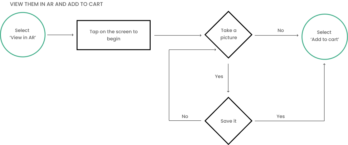
While I’m showcasing one of the most important task flows here, others were also developed using the same methodology, which also helped us design our low-fi and mid-fi wireframes.
Wireframes

Starting from low-fi to mid-fi, these wireframes were constantly tested from our users in order to improve the user flows and develop a style guide that could communicate the right brand identity as well as provide a smooth interactive hi-fi mockup for further testing.
We worked on the typography, color palette and the brand’s tone and voice that we thought best represented our client and got well connected with the user perception.
While getting user feedback on these style guidelines and finalizing the version that could be used in the hi-fi prototype, we also decided to go for a neumorphic style for the platform because it’s minimalistic and trendy, just like how our client and user depicts the brand.
Hi Fi Mockups

Style Guide
*use left and right arrows to view style guide below.


With the help of all the research and user feedback we were able to develop a new version of the existing online platform our client offered. We analyzed the old version thoroughly and depicted what were the essential sections that we needed to work on and improvise more. In the end we were able to compare both versions and felt a sense of accomplishment.

Did the prototype communicate the key factors effectively to the end user in order to provide a seamless experience?
To answer this question we moved to our next stage where we tested and analyzed the prototype from our users’ point of view.
iii(5) - Test
We followed the similar process used in the beginning of our prototype stage. We listed down the main objectives we wanted to be tested by our target audience. This way our team started the testing process with a clear goal in mind. These objectives included the following:
AS A USER
I find the brand trustworthy
I feel connected with the brand’s story and philosophy
I find the AR feature easily accessible and exciting to use
I am engaged throughout the customization process of my sunglasses
I feel satisfied with my online in-shop experience
I would like to purchase these trendy and environmentally sustainable sunglasses
I want to have their workshop experience
I find their website appealing and easy to use
User Test Methodologies
5 Second Test
Since FOS’ story is an essential part of our platform, the five second testing technique was used to gauge our users’ first reaction and perception of the brand.
Moderated Test
This approach was used to analyze what our users think. By asking them to “think aloud” we were able to understand their thought process and ask follow-up questions to achieve clarity.
Unmoderated Test
Our remote testing sessions were used to gather qualitative data about our users’ interaction journey with the platform and the over all impression about our design while simultaneously collecting quantitative data about their time on task and their clicks through the task flows.
During the process our users were given realistic scenarios as a frame of reference. From there, five specific tasks were assessed to determine our users’ thoughts and actions as they progressed through the main user flows. The platform we used for our remote testing sessions was Maze because it seamlessly compiles both qualitative and quantitative data for analysis.

Test Findings
Once collected the data we found out that most of the users really liked the minimalistic style of the website. During their feedback, they understood the brand and its service easily. They found the workshop experience exciting. But most importantly users liked the fact that they could customize their own sunglasses and view them in AR. Over all they had a positive perception towards the brand.

While the feedback provided with positive results, the quantitative data analysis indicated that our users found one of the task flows complicated to complete. Either they didn’t finish the task or struggled through many clicks to figure it out.
It was the TASK 3 where they had to interact with the AR feature and purchase the sunglasses.
We asked some of the users to explain their frustrations during the task and figured out that they found the AR screen unrealistic and unpredictable as well as had a hard time continuing to purchase the sunglasses once viewed on.
We immediately started working on the AR flow screens and conducted another usability testing with some new and some previous users to identify if the screens synchronized more with the user prediction this time.

User Value Proposition
The changes made the entire user flow starting with ‘customizing your sunglasses’ to ‘view them in AR and purchase’ much more seamless and exciting for the users. This user flow was very important for the brand as it had the main USER VALUE PROPOSITION :
- Customization of sunglasses
- View in AR before purchase
View the user flow in the video below.
iv - Growth Plan
For FOS to succeed in a competitive market, we ensured that our growth strategy plan was strong enough to achieve the brand’s vision.
We encouraged them to start locally but plan globally. Our comprehensive growth plan strategy outlined the necessary steps to grow from a local start-up to a global movement.
Growth Strategy Plan

The ‘ACT LOCAL THINK GLOBAL PLAN ‘ focused on spreading their message at different open-air markets around the city and align with small businesses to display their sunglasses at various shops.
From there FOS would promote their workshop on Airbnb Experiences and connect with larger organizations that share the same circular economy philosophy.
To expand outside of Barcelona, we encouraged FOS to reach out to climate activists and social media influencers to become brand ambassadors. Once their social media campaign is fully active, they could start expanding their manufacturing process.
Product Roadmap
While we created marketing assets and plans for a successful social media campaign, it was also necessary to develop a product roadmap that could help strategize the long term growth of our product as well as help the client visualize the correct implementation of their vision over time.
Our one-year product roadmap was created by first identifying four main “themes” worth considering.
Product Roadmap Themes

Product Roadmap Process
Once this was done, each theme was assigned with three specific goals and metrics. After each goal was meticulously inspected, we documented three initiatives for each goal. In the end, every theme was assigned with nine initiatives, which was then mapped on a timeline. Once the 36 initiatives were placed on the timeline, each initiative was prioritized and given a suggested timeframe. This same process was done for the 2-5-10 year roadmap, with an example of an expected backlog for clarification. The idea behind this process was to make it easy for anyone to create a design sprint or backlog for future endeavors.

v - Takeaways
Our passion for this project was cultivated from a need to seek meaningful work and was the very thing that drove us to find the company, FOS. After nine months on this project, we can proudly say that our team brought out the best in each other. We’re a strong unit comprised of too many ideas, sincere opinions and an innate desire to think outside the box.
We challenged each other comfortably, praised one another with excitement and relied on each other without hesitation.
Our comprehensive research plan and organizational structure helped guide our process. Each member of the team brought a unique set of strengths and experiences to this project. By highlighting each member’s skillset, we were able to create something far better than expected. We learned the importance of involving each member in the decision-making process because the best ideas always come to light during the most unexpected moments.
But, the most important thing of all, was to embrace each other’s differences, laugh at our own mistakes and share a bottle of Cava when working together passed midnight.


