UX Cases - Information Architecture & User Flow
Project
i - The Design Challenge
A couple months ago, I was sitting in my lounge with a cup of coffee scrolling through some articles when I got an email notification from a SAAS company, sending a design challenge for me to work on in 1 week’s timeline. It was my first design challenge experience and I was nervous yet very excited to start right away.
The challenge introduced an application called ‘DIAMUND’ which was a pricing solution SAAS specifically build for insurance companies. With the help of their AI technology, they wanted to change the industry standards of model predictions by making them extremely fast and highly efficient.
The Deliverables
1. Define the INFORMATION ARCHITECTURE of the global solution in the form of a tree structure with maximum 4 levels of hierarchy of the global solution.
2. Create a low-fidelity prototype showing the Admin flow, from the login to the users management. The prototype should include the following steps (and related features):
- login: where the Admin signs in using his email and password;
- user creation: where the Admin invites new users and attributes their permissions level (Actuary or Viewer);
- user management: where the Admin can see, modify and revoke user’s permissions.
Document every interaction that the Admin may need to take.
The Limitations
In order to accomplish these tasks it was necessary to get as much information regarding the user and product as possible. But what’s the point of a challenge if all the information is served on a platter ;)
So here were some limitations of the design challenge that I had to evaluate on my own before going towards building a solution.
1. User persona or any given research on the user (behavior, expectations, frustrations, observations etc) while using the application.
2. Lack of knowledge / experience of insurance industry and how an actuary works.
3. Limited information on the application to understand how it works and design the tree structure as well the Lo-fi prototype.
4. Lastly the limited timeframe i.e. 1 week in order to understand the process, identify the user and accomplish the tasks.
ii - Deliverable 1
Research
I went through the provided information in the design challenge and highlighted the data I found useful to move further.
With the given data and some desktop research I created an analysis board of the application to better understand the process and the user’s input at every stage.
With the help of this analysis, I was able to start understanding the structure of the application but before I could move forward with designing the Information Architecture, it was very important to know who the end user was and what was their possible usage scenario.
WHO IS THE END USER?
With the basic knowledge on insurance companies, I already knew that an actuary is someone who calculates different risks and predicts best suitable models for further developing pricing strategies.
But I believed that this information was not enough to proceed with their usage pattern and how they epxect the information architecture to be. So I immediately started conducting desktop research on actuaries and how their daily work life is. Some key factors included the following:
- The operation of insurance companies is largely based on the degree of risk they undertake and the returns that they generate from it. Which is why, they require employing advanced analytical and statistical skills to gauge risks and returns associated with each proposal they receive. Here is where an insurance actuary comes into the picture. - Godigit
- Becoming an actuary requires some of the skills of a gambler and some of the skills of a marathoner. You need a gambler’s understanding of statistics, probability, and risk analysis. - The Princeton Review
- Actuaries typically work 40 to 50 hours per week. They will spend three or four hours performing analyses such as loss and premium trends, estimating catastrophe exposure, and assessing the rates for different classes or groups of risk. These analyses are constantly changing due to items such as technology advances and the evolving nature of the insurance industry and marketplace. Some analyses take a day, while others take weeks. Another two to three hours a day go toward communicating the implications and results of these analyses to sales leaders, agents, product managers and state insurance regulators, both in written form and in meetings, with a visit in person at least once a year - Investopedia
These insights helped understand the user better and with that I moved to the next step which was to contact an actuary and conduct a short expert interview.
Due to the limited time, it was difficult to schedule a detailed video call with him and later conduct any card sorting tests to develop a more sound information architecture but, luckily with that call, I was able to define a user profile as well as a realistic usage scenario for this application.
Define
From there I identified the user (Mathilde Belli) goals, tasks and the necessary actions required while interacting with the application.
The important takeaway from all the user research and goals’ analysis was that the most crucial stage for any actuary is firstly, to calculate risks in order to assess and predict the most suitable models and secondly, inspect and enrich those models in order to finalize the pricing strategies. While the first part was majorly taken care by DIAMUND Application, the second part was still very crucial for the actuaries to perform their jobs.
At this moment, it was clear enough for me to define the hierarchy levels and justify with reasoning from my understanding.
Ideate
Hierarchy Level - Tree Structure
#THROWBACKDELIVERABLE1 - Define the INFORMATION ARCHITECTURE of the global solution in the form of a tree structure with maximum 4 levels of hierarchy of the global solution.
Level 1 - Login & Homepage
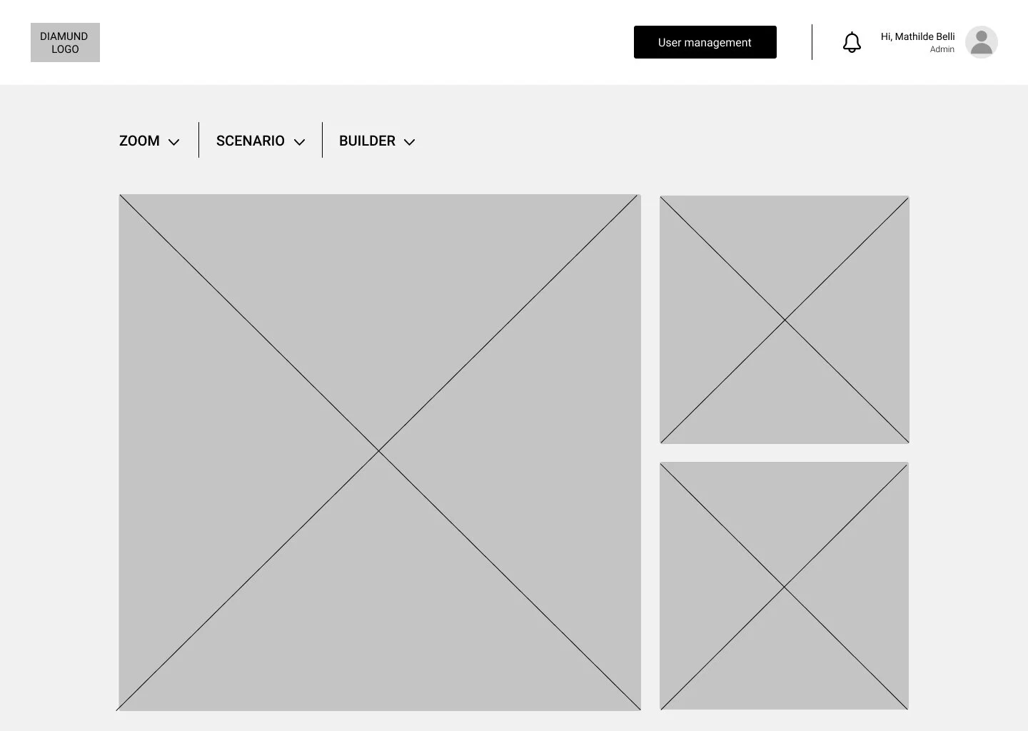
Being the first step in order to access the app is to login and land on the homepage (dashboard) showcasing the overview of the data.
Level 2 - ZOOM, SCENARIO, BUILDER
These are the main sections of the app and every section plays an important role to reach the final step i.e. deploy pricing models. Which is why all of them should be shown on the screen for the user to feel flexible when working in any section. Each section when selected will show the statistical data on their dashboards.
Level 3 -
ZOOM (Model Analysis, Generate Model)
Zoom is further divided into two main sections - Adding data to the system for the app to create models and analyzing those models. As user’s main goal is to analyze the models, it is shown first followed by adding a new model.
SCENARIO (Create, Test, Edit Pricing Scenarios)
Once the user decides to enter this section it will be for either creating OR testing OR editing the pricing scenarios which is why all these objectives are shown individually for the user to take a quick action.
BUILDER (Execute Models)
At this stage the user will have the finalized pricing model and the main goal will be to execute it in various projects.
Level 4 -
ZOOM (Model Analysis, Generate Model)
At this level the user will narrow down their focus and actions towards analyzing the automatized models through inspecting them which includes further actions such as compare, edit and export data. This will further help the user understand and develop interactions between statistics / variables to enrich the models. Edit database is a potential action that helps provide a margin of error for the user in case the database needs to be modified to improve the model analysis. This action will take the user back to the page where they imported and edited data for the system to process.
In order to generate a new model the user will be following a standard process of importing database, setting parameters, visualizing and editing data values in order to process a new model into the system.
BUILDER (Deploy Pricing Algorithms)
Similarly in this section again the user will narrow down their action to execute model by applying the set pricing algorithms to their projects in order to achieve desirable outcomes.
Below you can see the tree structure showcasing these levels.
iii - Deliverable 2
Prototype
Following onto my next challenge that was, to create a Lo-fi prototype showcasing the admin flow and documenting all the necessary interactions mentioned, I went back to the available information to make sure I can understand the user roles clearly before designing the screens.
Here the main goal was to focus on the Admin roles and design the admin flow accordingly.
#THROWBACKDELIVERABLE2 - Create a low-fidelity prototype showing the Admin flow, from the login to the users management. The prototype should include the following steps (and related features):
- login: where the Admin signs in using his email and password;
- user creation: where the Admin invites new users and attributes their permissions level (Actuary or Viewer);
- user management: where the Admin can see, modify and revoke user’s permissions.
Document every interaction that the Admin may need to take.
Below are some of the Lo-fi screens I designed showcasing the flow of adding a new user.
*Use the arrows to scroll from left to right.
After designing around 17 screens showing various admin actions, I began creating a usage story for the user persona, Mathilde Belli, and developed a task list that could lead our user to go through the admin tasks required.
Test
Task 1
- Log in to the app using your admin email id and password.
Here is the link to show how our user accomplished this task.
Task 2
- Invite a new Actuary, Leo Eduardo, to access the app. His email id is leo.eduardo@allianz.com.
Here is the link to show how our user accomplished this task.
Task 3
- Update and remove users.
Erika Pretzo - Change her permission level from Actuary to Viewer.
Adrian Linnon - He is no longer our employee so kindly remove his access from the app.
Here is the link to show how our user accomplished this task.
Task 4 (Last Task)
- Writing down a few names below. Please revoke their permission level from Actuary to Viewer.
Here is the link to show how our user accomplished this task.
Mathilde was very happy that all four tasks were done so smoothly within no time and now she was all set to start analyzing models when suddenly she hears a *beep*.
There was a message for her.
One of her colleagues, Erika Pretzo, forgot her log in password to the app and she needed Mathilde to rescue her from this problem.
OOPS.. TASK 5 ;)
- Generate a new password for Erika Pretzo.
Here is the link to show how our user accomplished this task.
These tasks were tested by only two user due to limited timeframe. Both users found the prototype simple and easy to interact with. To sum up their comments in a few lines, it will be something like -
“Hmm..That was quick!!! I ended up enjoying doing these tasks. I guess being an administrator suits me well ;)” - Mathilde Belli
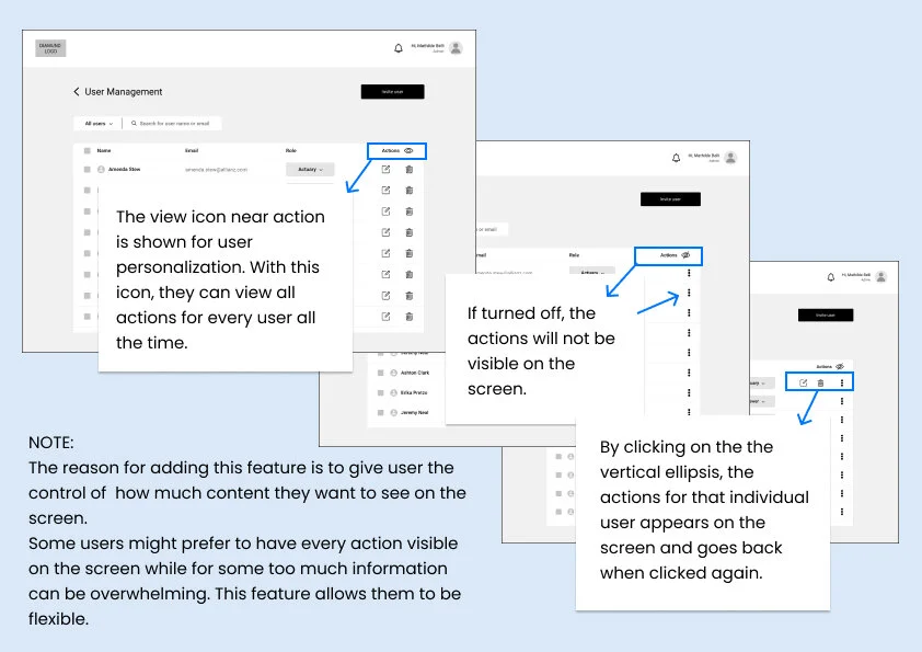
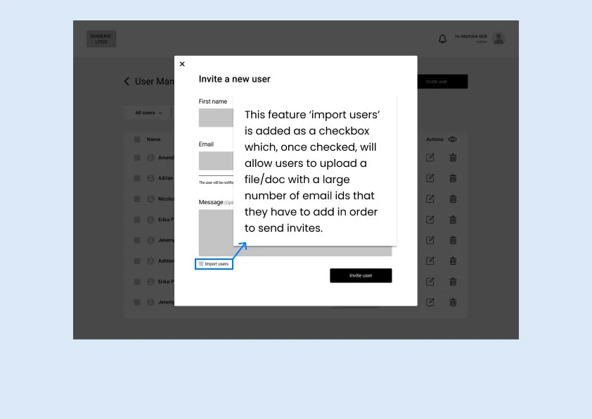
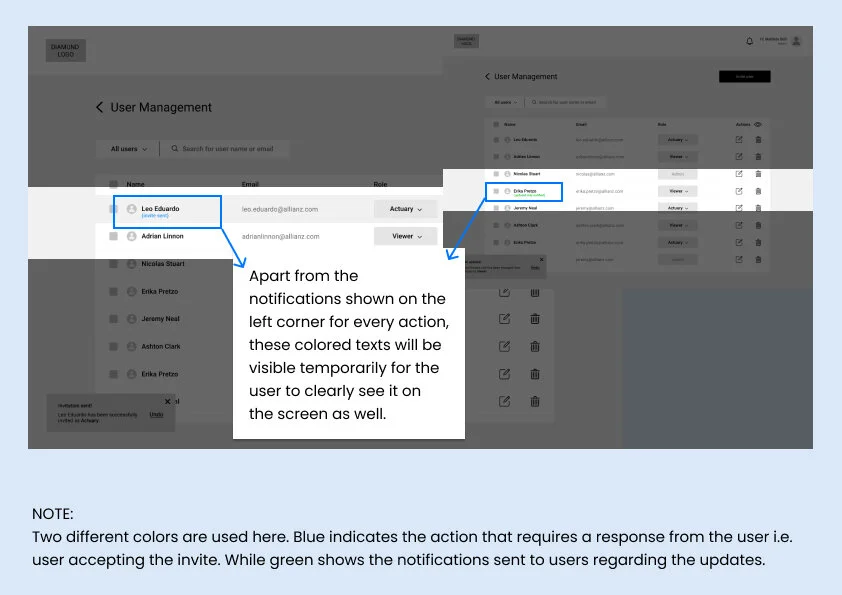
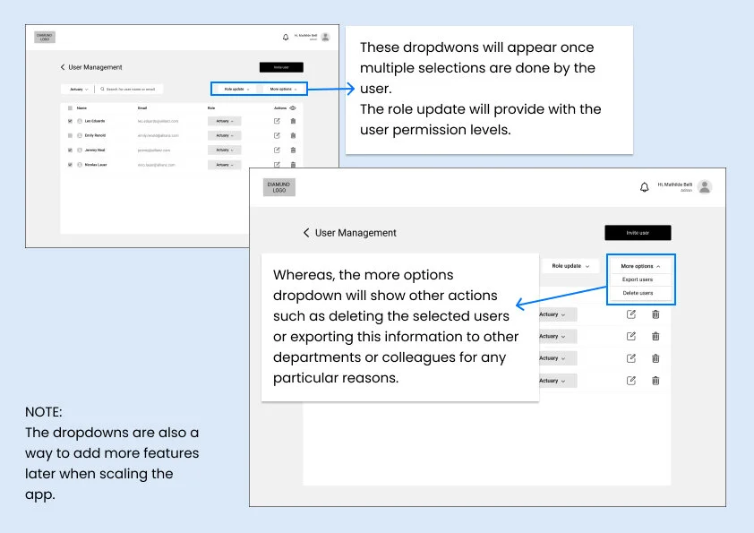
Lastly, I documented the screens and their descriptions in order to help explain the features I added in the prototype and their functionality.
The blue rectangles with arrows highlight those features that are being described in the white text boxes. At the bottom of the pages, you will see a few ‘NOTES’. They describe the over all concept I had in mind while designing those wireframes.
The document is shown below.
*Use arrows to scroll from left to right.
Takeaways
This challenge was an experience in itself. I learned a lot about insurance industry and actuary as a profession. It was also exciting to work on it as I was building user profile and usage scenarios in a short time with little information. Whatever research I could do was of great use in one way or the other when finding solutions for the deliverables.
With more time given, I would definitely want to conduct more user interviews, use card sorting technique, observe actuaries in their daily work life and do more user testings in order to obtain better results.
Lastly, I would like to thank my expert friend, an actuary by profession, who, on such a short notice, took out some time for an interview call and provided insights that helped me understand the role of an actuary thus, the end user in a lot more detail :)


